The KPI Org Chart

Or how to motivate Millennials, align your company behind your mission, and grow faster.
The best advice I ever read on hiring was “only hire for existing cash flows.” Naturally, I proceeded to ignore it for years. Instead I adopted the SV approach to “hire smart people and let them figure it out.”
Now that I’m consulting for some of these SV companies, I see firsthand what this anarchy looks like at scale. YMMV but I’ve found the high modernist approach to hiring in public companies looks like this:
- Create a list of work you think needs to be done
- Figure out which parts of the work you want for yourself or your existing team
- Organize the undesirable work into new job titles
- Google the job titles to find descriptions used by other companies (no need to find a similar employer, just pick the first result.)
- Lobby your finance and HR to approve your new reqs
- Everyone provides their own edits to the job description until its barely recognizable.
- ???
- Profit!
This whole process is awful, just awful. The worst part, however, is what is missing, the piece that motivates Millennials: the ability to learn, grow, and be a part of something bigger.
To fix this, we need a new kind of org chart.
Popular types of org charts
David Manheim penned a fantastic piece reviewing the different org structures and arguing that the classic hierarchy org chart is still the best due to the logarithmic properties of growth.
(Other options include a matrix design, the holocracy circle model, and an emerging network distribution.)
While Manheim’s analysis has a solid conclusion, he focused on how to lay out the org.
This is the wrong question.
Instead we should ask: what entities should the org chart map?
We assume an org chart should map titles, people, hierarchy, and this has advantages for the corporate lifer model of employment. As a salaryman, the org chart by title and name makes clear the rules of the game: do a good job (as defined by my boss) and I will one day have his desk/title/spot on the chart. That is, I can climb the ladder.
Yet Millennials are far more interested in the jungle gym model, so we either need to reorganize the chart to look like a jungle gym, which Manheim considered, or we need to change what is on the chart.
What if the org chart didn’t map titles, but KPIs? What if the KPIs of the entire org were mapped in a structure reflecting their dependencies, dotted line influences, and combinations?
This org chart would have some profound advantages.
Every employee can understand how their role contributes to something larger than themselves
A major motivation for Millennials joining startups is to see the impact of their work. Roughly speaking, the impact of your work is 1/n where n is number of people in your company. At a one-person company, the impact is 100%. At a 10,000 person company, the impact is 0.001%. Wow!
Corporations used to solve this with identity: by getting everyone at IBM on the same dress code, they won’t likely leave. They don’t know what their impact is, but they know they contribute to something larger.
The Identity approach was co-opted by your vendors and the larger tech culture, and there isn’t much left for your company to use, unless you want to be labeled a cult.
Instead of focusing on the “greater than ourselves” part, a KPI org chart allows you to focus on the “contribution” part. This allows the members of the org to find security in their contribution and the org itself to optimize for the right things.
Every employee can immediately see what motivates everyone else in their sphere
Joining a new company every 1–2 years, you don’t have time to build the deep familial trust with the key people in your org. Instead, you need to know the one thing motivating everyone around you at work. With a KPI org chart, you can understand at a glance everyone’s mission, KPI, and incentives. You can understand the alliance around you.
Openings on the chart look like tours of duty, not permanent identities
The entire notion of job titles is broken, supported only by the HR and Legal concerns to avoid lawsuits and accusations of discrimination.
Many companies recognize this and have adopted Reid Hoffman’s tours of duty model, where you define missions of finite length for each employee.
But then you need to interact with the outside world, and Hoffman’s own company forces you into picking a job title, and we all reinforce this fiction that we have infinite job positions until we get replaced by robots.
A KPI org chart solves this by making the impermanence explicit. KPIs change with the business, and the org chart should do the same.
Every role has a clear value associated to it that can be approximately inferred from the structure
My notional definition of an effective KPI isn’t SMART, it is far more simple: can I quantify the financial impact of this KPI?
This definition helps to remove bullshit KPIs like “got the website live this quarter” that don’t move the needle.
Everyone can choose the size of the job they can handle
My grandfather started delivering newspapers in his 60s after a surgery and a doctor recommendation to walk more. Never one to sit idly, he accepted more and more paper routes until he had a shift midnight to sunrise every Sunday morning.
Every employee has their own mental speed limit to how fast they can grow, and every company sets its own speed limits on them as well.
Some employees are BMWs with an Autobahn-ready engine stuck on a surface road. Others are bicycles thrilled that they are not on the Autobahn.
With a KPI org chart, everyone can find their own speed. Once someone has accomplished their primary KPI, they have the option to accept another KPI challenge.
When an employee with too many KPIs misses one for too long, it can be made available to other employees to try it.
In this way every employee will find their own speed limit.
No more talking about cost centers and profit centers. Instead, lets talk about growth vs efficiencies, offense vs defense, short term vs long term.
The last twenty years of downsizing and automation of work have led to an aggressive pursuit of the profit center. I first discovered this in Marketing, hearing the proclamations that with the right tools CMOs could carry a revenue number and no longer be a cost center.
This push to be a profit center is a reasonable defensive move for the department, but consider what it means when your General Counsel becomes a profit center, believing they must sue frenemies in order to justify their existence.
In reality, the only function that directly increases revenue is the Salesperson with a quota. Everyone else may have an important, critical function, but it is not a revenue center.
But this does not mean their jobs are unimportant.
With a KPI chart, I can see for example that my Marketing Operations Manager, with a KPI to reduce the time spent on duplicate records by the Sales team, makes the salesperson more efficient and so indirectly grows the company through efficiencies.
I can see that the R&D team is focused on a long-term defensive need to ensure the company has a product in ten years.
I can see that the finance team is focused on the short term defensive position to ensure we don’t run out of money and avoid total ruin.
With this, many conversations arguing for head count simply go away, as everyone can get on the same mental model of the tradeoffs between hiring for different KPIs.
No more sandbagging KPIs and OKRs, choosing 3 of 5 goals that are guaranteed or non-falsifiable to keep your job.
When you hire people first and then ask them for their OKRs, you give them a nice sense of autonomy. On the other hand, you give them space to always look good by creating bullshit KPIs that they can use to avoid getting fired.
This worked for GenX which was always going to create bullshit to look good, but Millennials need something stronger.
When you create jobs with specific KPIs mapped to the KPIs of others, you will know you have the right hire when they agree on the KPIs and understand how to accomplish them.
Really, less hiding overall
It was easy to hide in the 1970s corporate America, then along came downsizing and everyone had to start playing more defense and making moves to keep playing.
Then remote work made it easy to hide again: when you’re in the office, you might as well do something that looks like work, but if you are free to roam and not even log in, it is just all too easy to do no work at all.
KPI charts eliminate this by framing every conversation around KPIs and progress toward them. This will thrill the ambitious remote workers who want to be good at their job without focusing on metric “time spent with butt in seat.”
What does the KPI org chart look like?
Here is an example KPI chart for a SaaS marketing team reporting to the CEO:
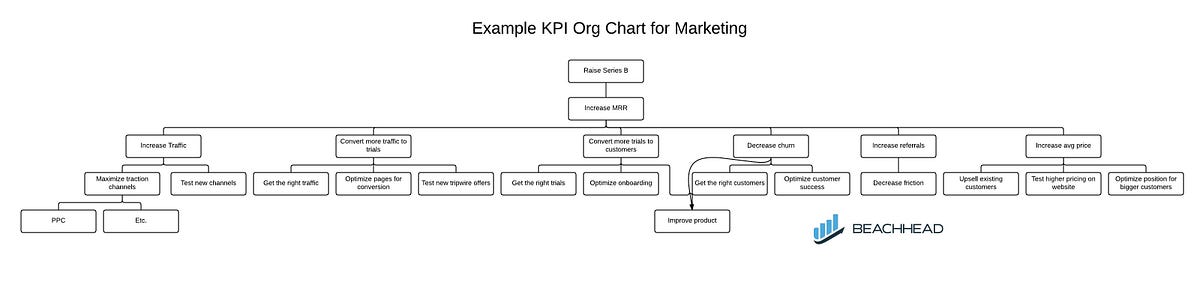
Using this chart, you can see at a glance all of the levers the company can use to grow MRR, which is a crucial KPI to raise the Series B. You can also see how product impacts new customers and churn (but not directly lead gen) and you might add branding as a factor to increase everything.
With this in place, the next step would be to clarify the target MRR, what inputs must happen to reach the target MRR, if these numbers are within reason, and only then who will commit to deliver each number.
Is the KPI org chart right for my company?
This model won’t work for every company: organizing around KPIs instead of identity is a wartime maneuver.
Companies leading their market, companies that can afford to win a war of attrition, and companies still solving for product market fit, will find this less relevant.
But if you’re stuck for where to hire, or you find yourself with an inflated organization, the KPI org chart might be the way you break through the noise.